Your home’s exterior color does more heavy lifting than most people realize. It shapes how neighbors perceive your property, influences buyer interest, and quietly adds or subtracts thousands from your home’s perceived value. The right shade makes a modest home feel stately. The wrong one makes a well-built house look cheap.
Homes that look expensive almost always rely on a handful of proven color strategies. They lean into deep, grounded tones, keep palettes restrained, and use contrast with intention. If you are exploring luxury exterior paint colors, the goal is not just to follow a trend. It is to create something timeless.
What Exterior Colors Make a House Look Expensive?
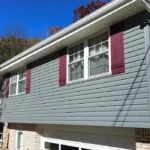
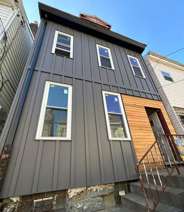
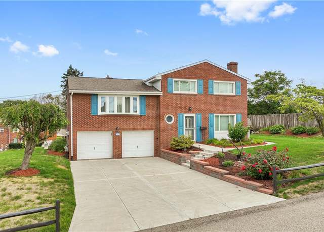
The colors that project wealth and refinement share a few qualities. They are muted rather than bright, carry visual weight without being overwhelming, and almost always fall within the neutral or deep-tone families. Charcoal gray, navy blue, forest green, crisp white, and warm taupe are the top performers.
Charcoal gray paired with light gray trim has become one of the most popular combinations for high-end homes. Navy blue with white accents creates a classic sophistication that works on Colonials and Cape Cods alike. Deep green with brass or gold fixtures leans into a moody elegance that feels curated. The common thread is restraint. Start with high-end house color schemes that prioritize depth over brightness.
Top Exterior Colors That Make a House Look Expensive: Color Palettes That Deliver
Some pairings consistently elevate a home’s appearance. Below is a quick reference of palettes that designers and real estate agents recommend for an upscale look.
| Color Palette | Style | Best For |
|---|---|---|
| Charcoal Gray + Light Gray Trim | Modern, sleek | Contemporary and transitional homes |
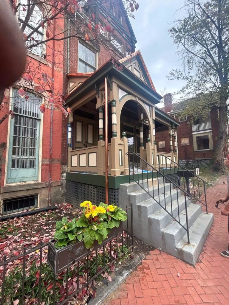
| Deep Green + Gold Accents | Moody, historic | Craftsman and Victorian styles |
| Soft White + Black Trim | High-contrast, tailored | Farmhouse and Colonial builds |
| Navy Blue + White | Classic, sophisticated | Coastal and traditional homes |
| Taupe + Natural Wood | Warm, organic | Ranch and mountain-style homes |
Each of these palettes works because it balances two or three tones without overcomplicating the look. The best luxury exterior paint colors never compete with each other. They complement.
What Exterior Colors Increase Home Value?
Paint color is one of the most cost-effective upgrades you can make before listing a home. A well-executed exterior paint job can increase a home’s value by two to five percent. That is a significant return for what is, comparatively, a modest investment.
Neutral palettes consistently perform best for resale. Greige has become a favorite among real estate agents because it appeals to the widest range of buyers. White exteriors, especially warmer tones like Alabaster, continue to signal cleanliness and care. Navy or black front doors alone have been linked to higher sale prices in multiple studies. If you are thinking about exterior colors home value, neutral and deep tones are your safest bet.
What Color Is Replacing Gray?
Gray has dominated exterior design for the better part of a decade. It is not disappearing, but it is evolving. The shift is toward warmer, earthier versions, specifically greige and warm taupe. These shades carry the same versatility but feel less sterile and more inviting.
Sage green is also emerging as a strong contender. It offers calm and neutrality with an organic quality that connects the home to its surroundings. The era of cool, blue-toned grays is fading. Warmth is in.
What Is the New Trend in Exterior House Colors?
The biggest shift happening right now is a move toward deeper, more expressive tones. Homeowners are getting bolder. Forest green, midnight blue, and even matte black exteriors are showing up more frequently. These darker palettes pair beautifully with natural materials like stone, wood, and copper hardware.
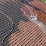
Earth-inspired colors are also surging. Terracotta, warm brown, olive, and cinnamon tones are replacing the cooler palettes of recent years. High-contrast combinations are trending as well, with dark siding paired against bright white or cream trim to define architectural lines. If your roof is due for an update alongside your siding, check out Best Atlas Pinnacle Pristine Shingle Colors for Pittsburgh Homes for shingle options that coordinate with these trending tones.
Why Finish and Material Choices Matter as Much as Color
Picking the right color is only half the equation. Matte and satin finishes are the go-to for exteriors that look modern and refined. High-gloss finishes can cheapen the appearance of even the best shade.
Material pairings matter too. Stone, brick, and real wood accents elevate any color palette by adding texture. A charcoal home with a stone accent wall looks far more expensive than the same charcoal on flat vinyl siding. If you are investing in high-end house color schemes, make sure the surrounding materials pull their weight.
How Contrasting Trim Elevates Your Exterior
Trim color is one of the most overlooked details in exterior design, but it has an outsized impact. Bright white or creamy off-white trim against a dark body color defines architectural features like window casings, eaves, and porch railings. It gives the eye something to follow and creates a sense of precision.
Without contrasting trim, even a beautiful siding color can fall flat. Think of trim as the framing around a painting. It does not have to be flashy, just deliberate. A strong exterior colors home value strategy always includes thoughtful trim selection.
Exterior Colors That Make a House Look Expensive: Common Mistakes to Avoid
One of the fastest ways to undermine a home’s appearance is choosing a color that is too bright or unusual. Neon greens, vivid purples, and hot pinks might reflect your personality, but they dramatically narrow buyer appeal. Overly trendy choices also carry risk. What feels exciting today can feel dated in a few years.
Another common misstep is ignoring existing fixed elements. Your roof, stone accents, and landscaping all have colors your siding needs to work alongside. Test samples directly on your home in multiple lighting conditions before committing. According to Reader’s Digest, real estate analysts consistently recommend sampling and sticking with neutrals for the broadest appeal.
Pulling It All Together
The homes that look the most expensive share a simple formula. They use deep, grounded colors paired with contrasting trim. They lean into natural materials for texture. And they avoid anything flashy or temporary.
If you are ready to explore luxury exterior paint colors for your property, take your time with the selection process. Sample multiple shades. Consider how they interact with your roof, landscaping, and neighborhood. A thoughtful color choice is one of the smartest investments in your home’s long-term value.